Graphical Charting
eFORMz Graphical Charting allows users to pictorially display information with bar charts and gauge charts. To follow along with the tutorials below, download the project files:
Delimiters
To add graphical representation, variables must first be created. Generally, this data must be delimited. For example, each value may need to be comma-delimited so as to separate one value from the other. This separation ensures that each value will be graphed as its own piece of data.
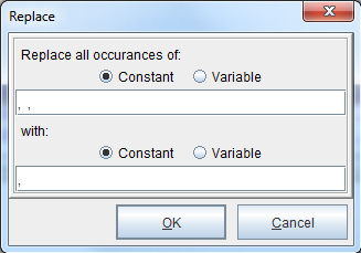
1. Right click the variable that is picking up the data to be charted and select Add Function > Replace.
2. The Replace dialog box will display. In the Replace all occurrences of field, enter the characters to replace. To account for spaces, simply enter a few spaces into the field. In the With field, enter a comma. Click OK.
3. Continue adding variables for data parameters and making sure the values are comma-delimited.

Bar Charts
To place a bar chart, right-click a paragraph element in the Document Template and select Add chart > Bar chart or right click in the Form and Data Viewer and select Add Rule > Bar Chart.
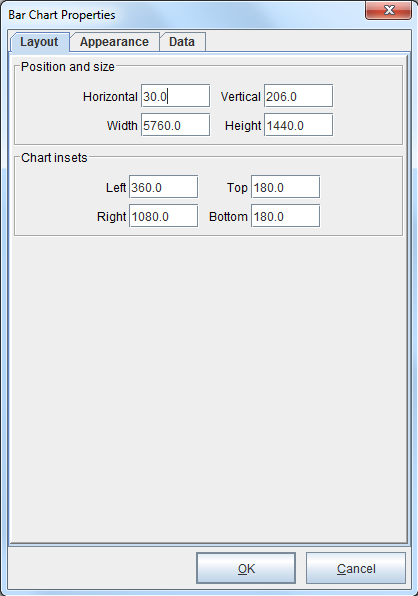
1. The Layout tab of the Bar Chart Properties dialog box will display. Adjust the position, size and insets of the chart as necessary. Good reference sizes for the Width, Height and Chart insets are those illustrated below. Switch to the Appearance tab.
2. Enter a title for the chart, or select a Variable for the Chart title field. For the Chart Appearance section, choose a Resolution and whether the chart will be Vertical or Horizontal. For 3D bars, check the 3D button and provide a depth. From the Bar type drop-down menu, pick one of the following options: Stacked bars, Side by side bars, or Bars one behind another. When complete, select the Chart title font and color button.
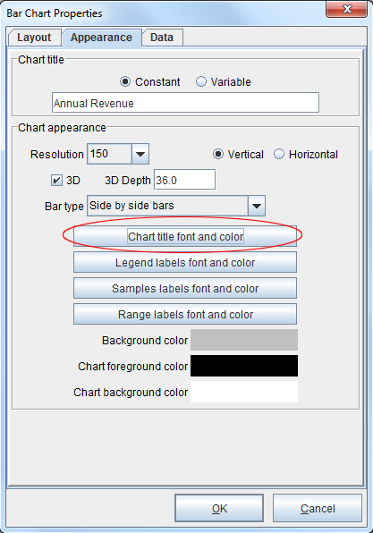
3. Modify the font and color as needed and click OK. Continue adjusting the font and color of the chart sections as seen fit. Switch to the Data tab.
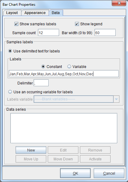
4. Check the Show samples labels and Show legend boxes, enter 12 for the Sample count and alter the Bar width if desired. From the Samples labels section and Labels field, enter the months of the year as a constant value. From the Data series field, select the New option.
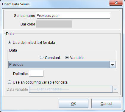
5. The Chart Data Series dialog box displays. In the Series name field, enter “Previous year.” Adjust the Bar color by selecting it and changing it accordingly. From the Data drop-down menu, select the Previous Variable created earlier.
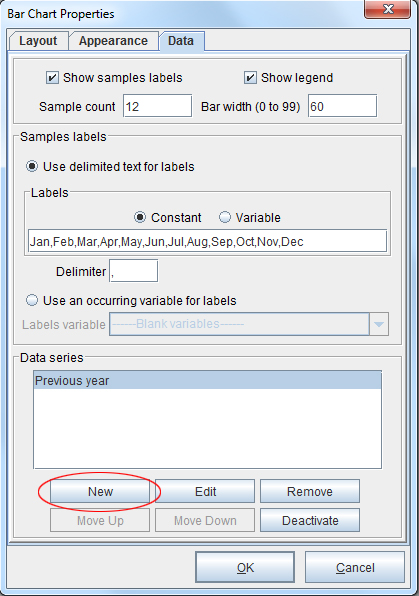
6. The series name will be visible in the Data series field. To add another set, select the New option again.
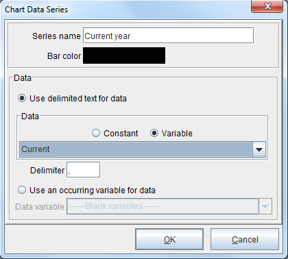
7. Enter “Current year” in the Series name field and adjust the color if appropriate. From the Data drop-down menu, select the Current variable created earlier. Click OK and select the New option again.
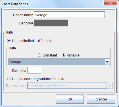
8. Enter “Average” in the Series name field and adjust the color if appropriate. From the Data drop-down menu, select the Average variable created earlier. Click OK.
9. The bar chart will display in the Form and Data Viewer.
Gauge Charts
To place a gauge chart, right-click a paragraph element in the Document Template and select Add chart > Gauge chart or right click in the Form and Data Viewer and select Add Rule > Gauge Chart.
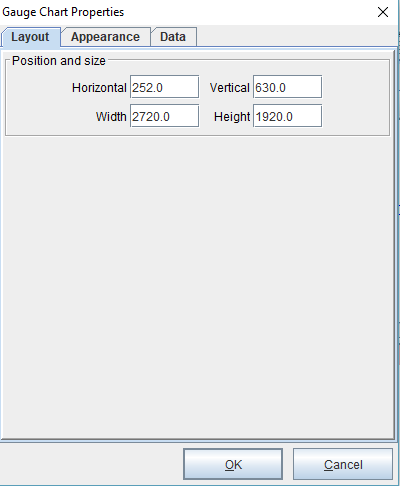
1. The Layout tab of the Gauge Chart Properties dialog box will display. Adjust the position, size and insets of the chart as necessary. Good reference sizes for the Width, Height and Chart insets are those illustrated below. Switch to the Appearance tab.
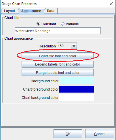
2. Enter a title for the chart, or select a Variable for the Chart title field. For the Chart Appearance section, choose a Resolution.When complete, select the Chart title font and color button.
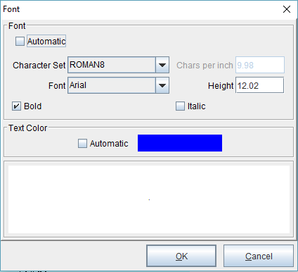
3. Modify the font and color as needed and click OK. Continue adjusting the font and color of the chart sections as seen fit. Switch to the Data tab.
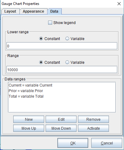
4. Enter values for the Lower Range and Range fields. From the Data series field, select the New option.
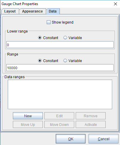
5. The Chart Data Range dialog box displays. In the Range name field, enter the name representing variable data. In this example, a value of “Current” was entered. Adjust the Bar color by selecting it and changing it accordingly. From the Data drop-down menu, select a Variable created earlier. Click OK.
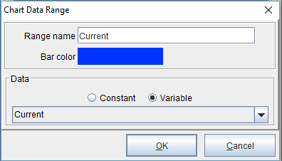
6. From the Data series field, select the New option. Repeat step 5. Do these steps with as many data ranges as needed for the completion of the gauge chart. Click OK to place the Gauge Chart.